Style Fusion: A Practical Guide To Mixed Interior Design
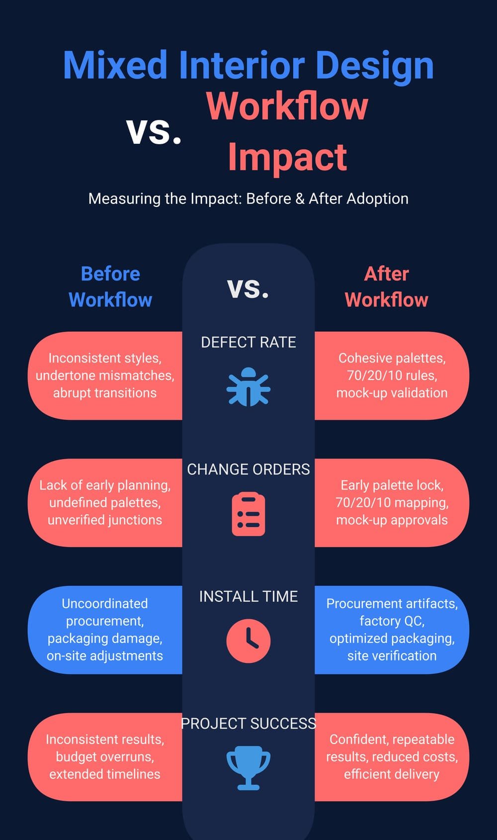
Designers want confident, repeatable ways to mix styles without ending up with a patched, inconsistent space. This how-to gives you a field-tested workflow you can carry from concept to procurement to site QA.
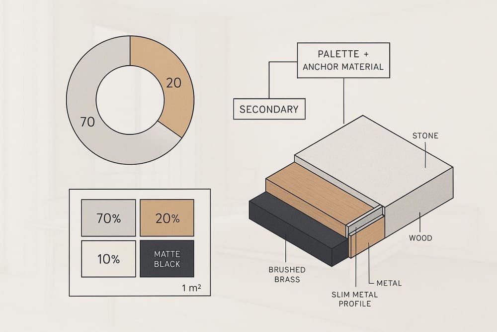
Expect to: lock a palette and anchor material first, map proportions with 70/20/10, predefine junctions (stone–wood–metal), validate with a 1 m² mock-up, and encode everything into a procurement and QC plan.
Time and difficulty
- Time to execute the full workflow on a typical room: 1–2 weeks (including sampling and mock-up approvals)
- Difficulty: Intermediate (designer) + Process (PM/procurement)
Executive Takeaway
Lock your color/material palette and select an anchor material first. Then enforce a clear proportion rule (70/20/10), design your transitions early with proper trims and movement allowances, build a 1 m² mock-up under project lighting, and translate all decisions into a BOM, finishes schedule, factory QC, packaging, and site verification plan.
Why this works
- Proportions like 60/30/10 and 70/20/10 prevent accent creep and visual noise, a practice widely recommended in recent guidance from 2024–2025 design editors and practitioners such as the explanatory breakdown in House Beautiful’s 2025 color rule explainer and the flexible variant described by LivingEtc in 2025 on the 70/20/10 approach.
- Cohesive palettes and repeated anchor materials unify mixed styles across rooms, as emphasized in Havenly’s 2025 guide to mixing styles.
Key Points
- Palette and anchor material drive cohesion; form language follows.
- Use 70/20/10 to control visual dominance; variants like 60/30/10 are fine if dominance remains clear, a point echoed in The Decorholic’s 2025 overview of color distribution.
- Detail transitions early (avoid “hard cuts”): match profile height to tile thickness, allow for movement joints per standards, and choose reducers where heights differ; see manufacturer handbooks such as the Schluter floor profile guidance (2025 update).
- Validate with samples and a 1 m² mock-up in actual lighting; document approvals with annotated photos per institutional practice like the NIH Design Requirements Manual, 2024.
- Encode decisions into a BOM, finishes schedule, QC plan, and packaging/logistics instructions drawing on Division 01 conventions, for example, Dartmouth’s 2025 Division 01 project guidelines.
Steps (Do this in order)
1) Define the palette and anchor material
- Decide 2–3 core tones (e.g., cool gray + warm oak + brushed brass accents).
- Choose the anchor material that will dominate sightlines and surfaces (often floor tile/stone, wood flooring, or large wood veneer fields). Repeat it to tie styles together.
- Why: A cohesive palette sets mood and continuity, and repeating a tactile material unifies mixed styles, as design advisories note in sources like Havenly’s 2025 mixing-styles guide.
- Verify you’re right: Place large samples adjacent; check undertones in daylight and the project’s artificial lighting.
Decision tree (materials)
- Start: Palette locked?
- No → Build a small board of large swatches until undertones align.
- Yes → Select anchor material (dominant surface).
- Anchor material selected?
- No → Prioritize the surface with the largest continuous area (floor/wall cladding).
- Yes → Choose complementary secondary materials (texture contrast, undertone harmony) → Select accent metals and textiles.
2) Map 70/20/10 across real surfaces
- Assign 70% to the dominant base (walls/floor/large millwork), 20% to a contrasting secondary (wood veneer, secondary stone, color-blocked wall), and 10% to accents (lighting, hardware, textiles).
- Why: Proportion rules prevent style overwhelm and “visual shouting.” See the 2025 explanation of the classic distribution in House Beautiful’s color rule guide and the immersive 70/20/10 variant in LivingEtc 2025.
- Verify: Sketch a ratio map on plan/elevations. If accents exceed 10%, demote items to the 20% bucket or swap to neutrals.
3) Choose compatible finishes (gloss/matte, texture, undertones)
- Keep a hierarchy: if your anchor is matte and textured (oak), balance with smoother secondary stone and a low-sheen metal.
- Match undertones: Warm brass pairs with warm oaks; blackened steel and cool gray stones complement cooler palettes.
- Verify: Photograph samples under the project’s lighting schedule and review side-by-side. If it jars, adjust the metal finish first before changing anchors.
4) Design transitions and junctions early (stone–wood–metal)
- Flush transitions: When tile meets wood at equal height, specify a slim metal T-profile matched to tile thickness; tile surface should be flush with or up to ~1/32″ (1 mm) below profile top per the Schluter floor profile handbook, 2025.
- Height differences: Use reducer profiles (e.g., RAMP styles) and factor in any uncoupling membrane thickness during selection, also noted in the same handbook.
- Movement joints: Include movement accommodation per TCNA EJ171/ANSI; profiles do not replace movement joints, a requirement reiterated in the DITRA-HEAT installation handbook, 2025.
- Visual softeners: Consider a narrow stone or metal border strip to ease a strong style shift.
- Verify: Build a small junction mock-up (see Step 5) with exact materials and thicknesses. Check for toe-stub risks, lippage, and consistent reveals.
Recommended trim/profile menu
- T-profile for equal height tile–wood
- Reducer/ramp for height differences
- Shadow/reveal trims at wall–ceiling transitions for clean lines
- Flexible sealant at dissimilar material joints where specified
5) Build and approve a 1 m² mock-up board (+ junction mock-up)
- Board content: Anchor material (largest swatch), secondary material(s), accent metal, representative fabric/leather, small paint-out card in the chosen tone, and a mounted sample of your chosen transition profile with both adjacent materials.
- Lighting: Review under project lighting and daylight to catch undertone shifts. Institutional practice stresses defined review conditions and documentation, as in the NIH Design Requirements Manual, 2024.
- Documentation: Annotate photos with arrows/callouts for finish codes, batch numbers, and profile types. Sign and date approvals; store images in the project submittal log.
- Why 1 m²: It’s large enough to read texture and color interactions reliably; hospitality teams regularly approve life-size mock-ups as a benchmark, as described in Profica’s 2024 note on hotel room mock-ups.
Sample callouts (what to label)
- Anchor material: species/stone, finish, thickness
- Secondary: finish sheen, pattern scale
- Accent metal: alloy/finish (e.g., brushed brass vs black titanium)
- Profile: model/type, height, finish
- Lighting: CCT/CRI used during review; time-of-day photo
6) Convert decisions to procurement artifacts
- BOM and finishes schedule: List each item with material, finish, dimensions, supplier, quantity, and link to sample ID and approved photo. Division 01-style documentation and submittals are standard practice across institutions like Dartmouth’s 2025 Division 01 guidelines.
- Factory QC checkpoints: Require dimensional checks, finish uniformity, edge quality, and profile height verification; vendors provide QC photos/reports before packing. General QC plan structures from construction management can guide the flow, e.g., Quickbase’s 2025 overview of QC in construction.
- Packaging and logistics: Specify stone on A-frame crates, edge/corner protection, moisture barriers, desiccants, orientation labels, and delivery sequencing by install phase; see trade recommendations like IMFTile’s 2025 ceramic packaging practices.
- Verify: Make submittal compliance a gate; no production until all samples and mock-ups are approved and logged with finish codes.
7) Site verification and troubleshooting
- Substrate prep: Enforce flat, clean substrates and appropriate backings per tile industry guidance, summarized by the Ceramic Tile Foundation on substrate prep (2024).
- Installation checks: Confirm profile heights vs actual tile/wood thickness; maintain flushness and movement joints; remove burrs on metal trims per installation guides such as Schluter’s 2025 stair and profile notes.
- Lighting recheck: After install, reassess undertones with final lighting and window treatments before sign-off.
- Punch list: Compare installed conditions against your mock-up photos and finishes schedule; document deviations and corrections.
Examples and Alignment Phrases
Go-to ratio and material pairings
- Modern + Classic: Matte black + warm oak + brushed brass
- Modern + East Asian: Light gray stone + dark walnut + black titanium metal
- Modern + Light Luxury: White/gray-veined marble + champagne gold + leather accents
Stakeholder alignment phrases you can use
- “Let’s lock the palette and anchor material first; forms follow once undertones are stable.”
- “We’ll cap accents at 10%—if something creeps, it moves into the secondary bucket.”
- “We’ll prefabricate the trim profile and test the stone–wood junction in a mock-up to avoid hard cuts on site.”
Pattern and texture sanity checks
- Keep pattern scale varied to avoid competition; this complements proportion rules discussed in resources such as Lark Interiors’ 2024–2025 advice on mixing pattern scales.
Risks and How to Prevent Them
- Proportion drift (accent >10%): Reassign items from the 10% bucket to 20%; neutralize some accents. This issue is commonly flagged in overviews of the 60/30/10 family of rules like The Decorholic’s 2025 guide.
- Undertone mismatch: Always test under project lighting; if warmth/coolness conflicts, change metal finish first before swapping anchor.
- Abrupt transitions (“hard cuts”): Specify a profile matched to thickness, or add a slim border strip; include movement joints per standards, as noted in the DITRA-HEAT handbook (2025).
- Substrate/flatness issues: Follow tile industry tolerances and use appropriate membranes/backers; see the Ceramic Tile Foundation’s substrate prep guidance (2024).
- Packaging damage in transit: Require photos of crate build, shock indicators, and edge protection; specify delivery sequencing to minimize double handling, aligning with packaging best practices like IMFTile’s 2025 ceramic packaging notes.
Toolbox (Neutral, implementation helpers)
- Palette and sampling: Local material libraries; digital palettes; large-format sample vendors.
- Trim/profile sourcing: Metal profile systems; local millwork/fabrication shops for custom transitions.
- Mock-up and documentation: Photo annotation apps; submittal tracking tools; cloud folders with revision control.
- One-stop sourcing and QC support: ChinaBestBuy — integrated material sourcing, prefabricated trims, QC inspections, and global logistics to streamline the palette→procurement→delivery chain.
Practical Example (Process you can copy)
Scenario: Modern + Classic living area; stone tile to wood floor transition at the dining boundary.
- Palette + anchor: Lock cool gray porcelain as anchor (70%), warm oak veneer as secondary (20%), brushed brass accents (10%).
- Junction: Choose a slim brushed brass T-profile matching tile thickness; confirm flushness with wood; include a movement joint where required by the layout.
- Mock-up: Assemble a 1 m² board with tile, oak veneer, brass strip mounted between, and fabric/paint accents; review at 3000K/90+ CRI task lighting and daylight.
- Procurement: Add line items to the finishes schedule with finish codes, profile model, and approved sample photos; set factory QC checks for profile height and finish consistency.
- Logistics: Require A-frame crating for tile, corner protection, and moisture barriers; sequence delivery to align with flooring install week.
- Where a partner helps: A sourcing partner like ChinaBestBuy can coordinate factory-prefabricated trims, batch-matched samples, QC photo reports, and export packing to reduce on-site adjustments.
Appendix: Procurement Checklist Template (70/20/10 encoded)
Use this as a starting point; copy into your submittal system and adapt.
Project basics
- Project name / Area / Date / Revision
- Lighting spec for review: CCT / CRI / Scenes tested
Palette & ratio
- Dominant (≈70%): Material, finish, code, area assignment
- Secondary (≈20%): Material, finish, code, area assignment
- Accent (≈10% max): Material, finish, code, area assignment
- Drawing set annotated with ratios attached? Yes/No
Samples & mock-ups
- Large samples received (sizes noted) for all materials? Yes/No
- 1 m² board assembled and photographed under project lighting? Yes/No
- Junction mock-up includes selected profile and both adjacent materials? Yes/No
- Approval sign-offs attached with annotated photos? Yes/No
Transitions & tolerances
- Profile type/model/finish; height matched to tile/wood thickness
- Movement joint locations indicated per standards
- Substrate flatness and prep strategy documented
BOM & finishes schedule
- Each line links to sample ID and approved photo
- Quantities verified vs drawings
- Alternates listed with objective trade-offs
Factory QC
- Dimensional checks, finish uniformity, edge quality criteria defined
- Pre-shipment QC photos/reports required
Packaging & logistics
- Packing method per material (e.g., A-frame for stone; corner/edge protection; moisture barriers; desiccants)
- Labels with orientation/handling; shock/tilt indicators where appropriate
- Delivery sequencing aligned with install phases
Site QA
- Installed conditions photographed next to approved board photos
- Junctions checked for flushness/reveals; movement joints present
- Punch list cleared; closeout documents filed
Next Steps
- Primary: If you want to fast-track a mixed-style scheme, request ChinaBestBuy’s one-stop material package or QC sample set.
- Secondary: Prefer to explore first? Download the sample/mood board kit and the procurement checklist template to try the workflow on a pilot room.